Let’s say you have highload instances. How do you monitor them? There are a lot of servers with 100, 200… 500+ nodes. How can we collect, check, and analyze metrics from all these servers? How can we understand what and where something happened? Scroll, scroll, scroll… down? That was the task that we faced at Percona and successfully resolved.
Issue With Home Dashboard
Percona Monitoring and Management dashboards are based on Grafana. So, when you opened PMM, you can see Grafana’s dashboards. Home Dashboard on the main page of PMM contains different metrics from all environments, databases and other resources. You can see here panels with current resources’ utilization - CPU, Memory, Disk Space, I/O Operations, Network. Certainly, these are very important metrics, which can help us quickly catch some issues… But after some years, we noticed that instances have more and more nodes. And we caught an issue with our Home Dashboard. At big instances (more than 100…200..etc nodes), there were performance issues. It was tough to understand what happened, and a user needed a lot of time for checking. From this point, we started our way.
Searching the Root Cause of Our Issues
Before starting an investigation and searching for “bottleneck”, we defined some questions to answer first:
- What’s happened?
- Where to catch performance issues?
- How can we fix it?
Let’s answer these questions! To find out what’s happened, we need to check the response time for our Home Dashboard. So we created a PMM instance with 200 nodes for testing.
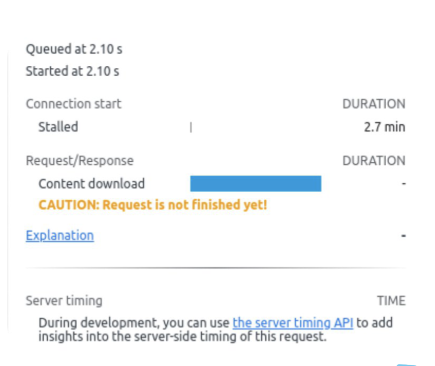
What can we see here? Loading time is more than two minutes! Let’s dive deeper and check the longest requests.
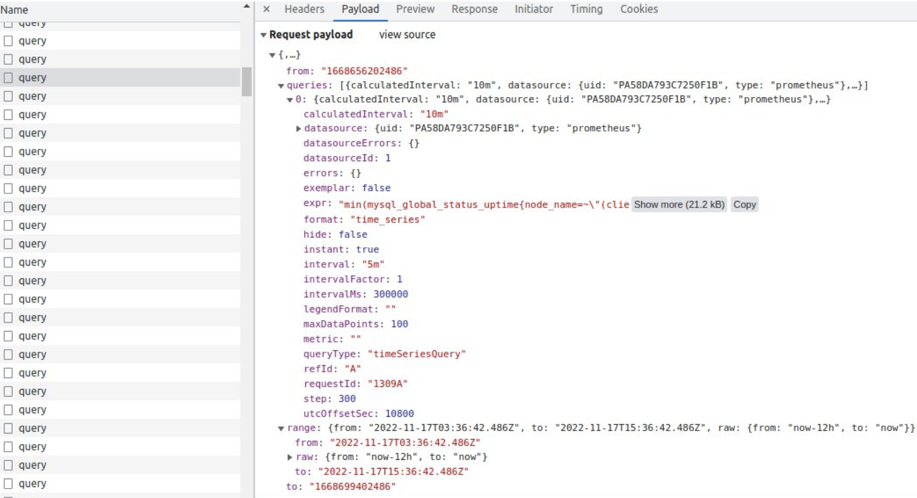
The longest time takes to get a request to VictoriaMetrics storage. If we try to scroll down, we can see “Lazy load” of our page and slower and slower working of our browser. Why? Because we request tons and tons of metrics.
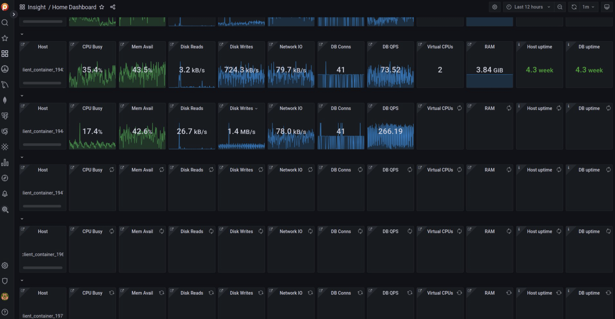
And it seems that we caught here our main problem - too much data, too many requests, and too many responses. What can we do? We decided to create a new Home Dashboard!
Strategies for Creating a Dashboard
There are a lot of strategies for creating dashboards. But we need a short, informative, user-friendly one. Our final goal is to provide a simple answer for the questions: “Is it all good? I want to drink my morning coffee” or “Is something bad? We need to repair it ASAP!”
Let’s investigate what we can do here.
In the O’Reilly Site Reliability Engineering book, we can read about four golden signals strategy: Latency, Traffic, Errors and Saturation. Let’s meet each of these signals.
Latency
Latency means the time it takes to service a request. One important moment — differences between successful and unsuccessful requests.
For example, an HTTP 500 error means that the connection was lost and this error served very quickly, however, as an HTTP 500 error indicates a failed request, factoring 500s into your overall latency might result in misleading calculations. On the other hand, a slow error is even worse than a fast error! Therefore, it’s important to track error latency, as opposed to just filtering out errors.
Traffic
Traffic is a measure of how much demand is being placed on your system. For web service, it is usually HTTP requests per second, for audio may be network I/O rate, for key-value storage systems — transactions and retrievals per second.
Errors
Errors are the rate of requests that fail, either explicitly (e.g., HTTP 500s), or implicitly (for example, an HTTP 200 success response, but coupled with the wrong content).
Monitoring these cases can be drastically different: catching HTTP 500s at your load balancer can do a decent job of catching all completely failed requests, while only end-to-end system tests can detect that you’re serving the wrong content.
Saturations
It is a measure of your system fraction, emphasizing the resources that are most constrained (e.g., in a memory-constrained system, show memory; in an I/O-constrained system, show I/O). Note that many systems degrade in performance before they achieve 100% utilization, so having a utilization target is essential.
If you measure all four golden signals and call for a human when one signal is problematic (or, in the case of saturation, nearly problematic), your service will be at least decently covered by monitoring.
There are also USE and RED strategies that we took into consideration.
R — Rate, request per second E — Errors, how many request return error D — Duration, latency, the time it takes to service a request
U — utilization, how fully resource working S — saturation, how long queue at this resources E — errors, how many errors do we have?
POC of Home Dashboard
All these strategies are interesting and helpful. But we want to compile the best for our dashboard. Our Tech Lead Dani Guzmán Burgos created a Proof-of-Concept (POC) of our new Home Dashboard. Our main idea is a simple answer to the questions “all good” or “is something bad.”
When you open this dashboard, you can see simple color panels — green or red. How do we measure this?
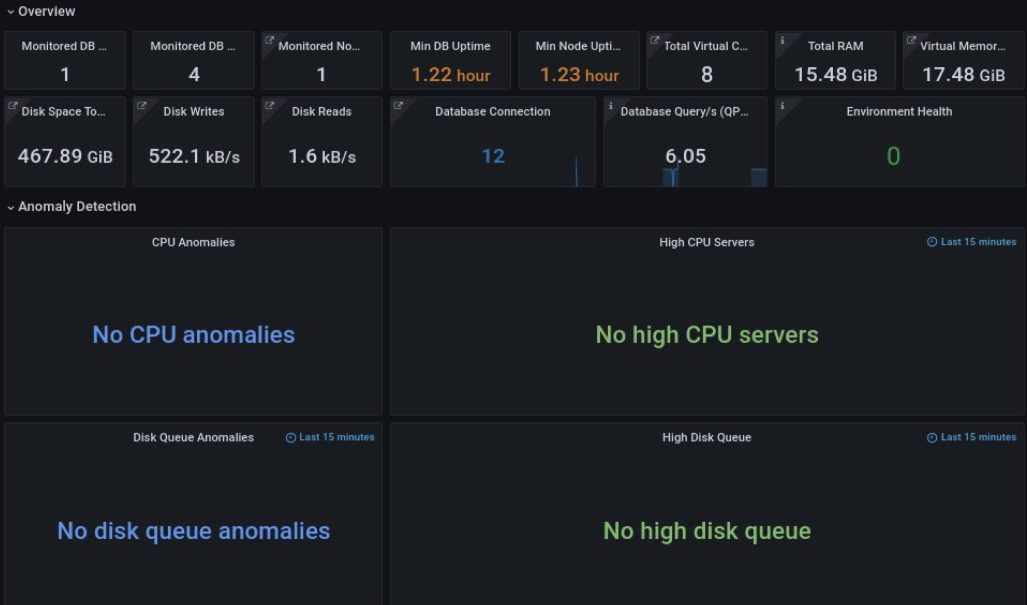
Here we can see common information about our environment: how many nodes we have, disk operations, DB and node uptime, and advisors’ checks. There is also a very interesting panel with the name “Environment Health,” which is our secret feature.
For anomaly detection, we use CPU and disk metrics. And here, we also answer questions about how fully our resources are working and what duration we have. On the right panels, we can see data with 15 minutes relative time (to prevent peaks and performance issues). On the left side, we can compare current metrics with metrics from a week ago to measure trends.
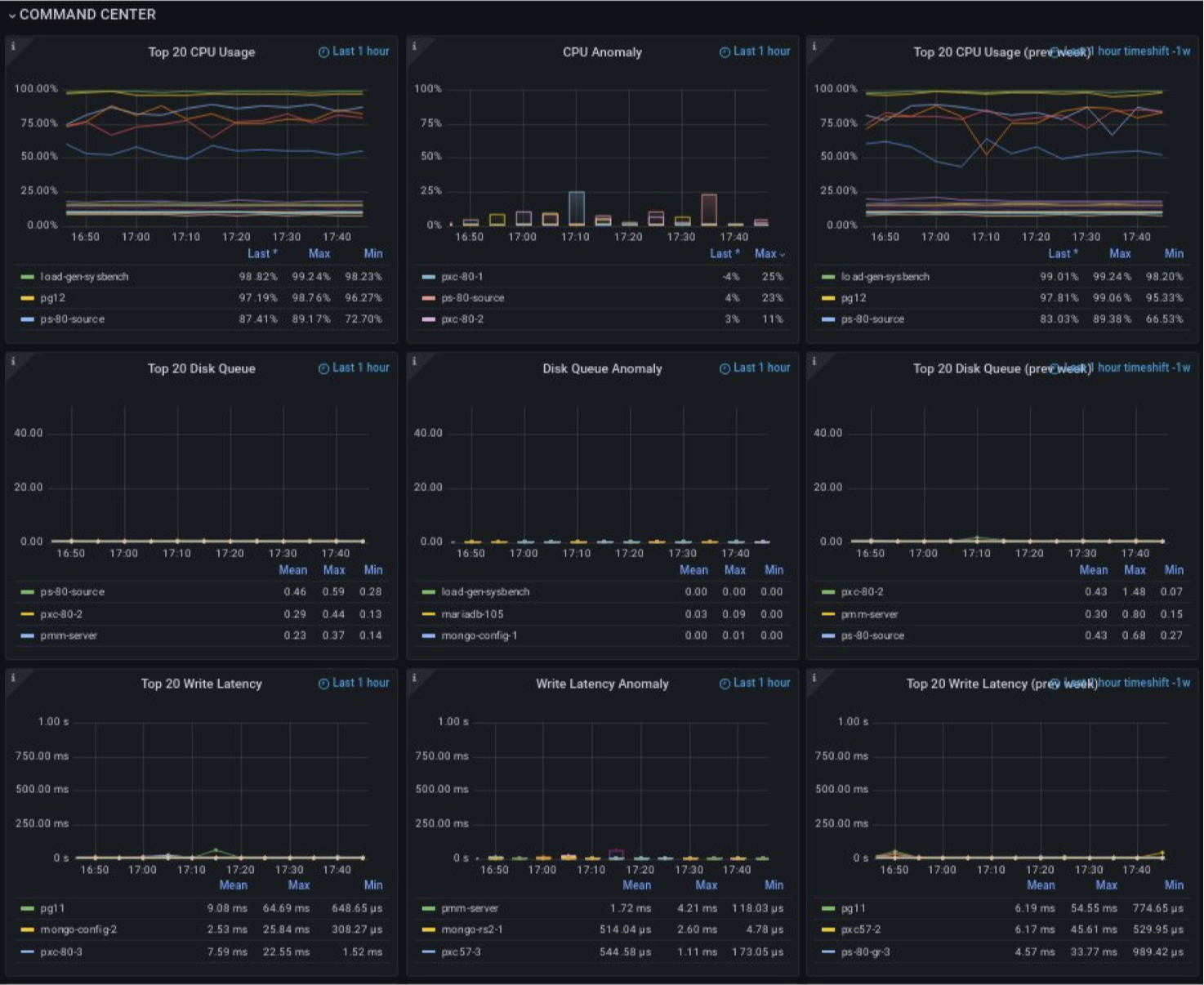
In the Command center, we can find more details about what’s wrong. There are three kinds of panels: current usage, anomalies, and metrics for one week ago.
As main metrics, we use CPU, disk queue, write latency, read latency and used memory. These metrics can very quickly help us understand what’s happened in our system.
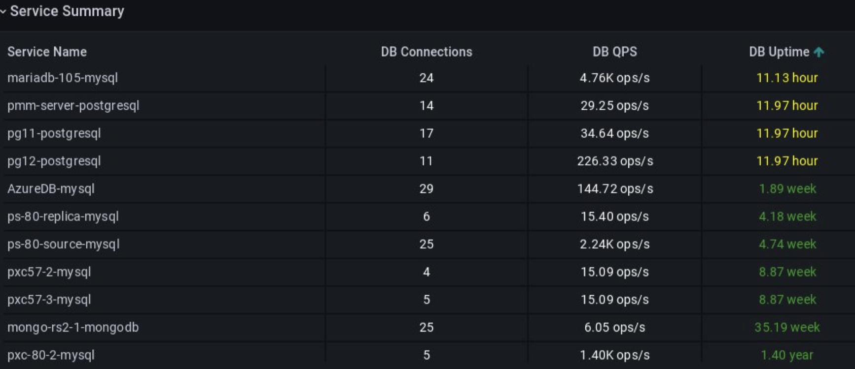
And finally, the panel Service Summary shows detailed information about each service (node, server) in our system: number of connections to DB, QPS at each of them, and uptime.
Polishing the Dashboard - Feedback Matters
When we discussed the POC with other teams, we got the question, “what does it mean — No anomalies?” Then we added a detailed description “No alerts because CPU less than xx percent.” Sounds better, doesn’t it?
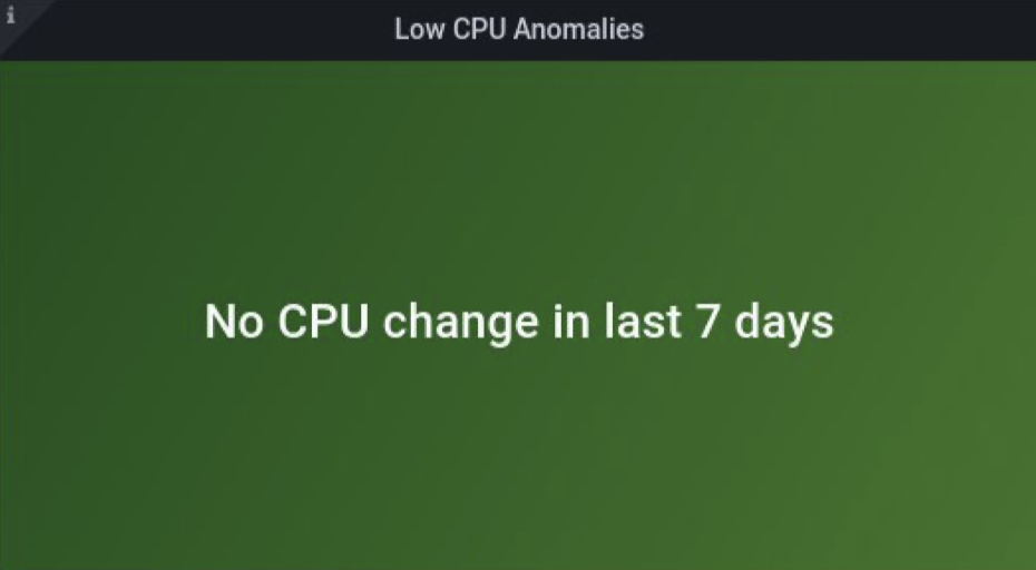
Our previous dashboard looked good, but we wanted more! What could we improve? We already have CPU, Disk anomalies, maybe we can add more metrics here? And we did! High memory? Perfect! Also, to prevent paying a lot for unused hardware, we implemented “Low CPU Servers” where we get alerts when using less than 30 CPUs.

When we have red statuses for nodes in the Anomaly Detection section, we can explore it and drill down. We can jump to a more detailed level and check what happened - CPU, Disk, and Memory for each metric.
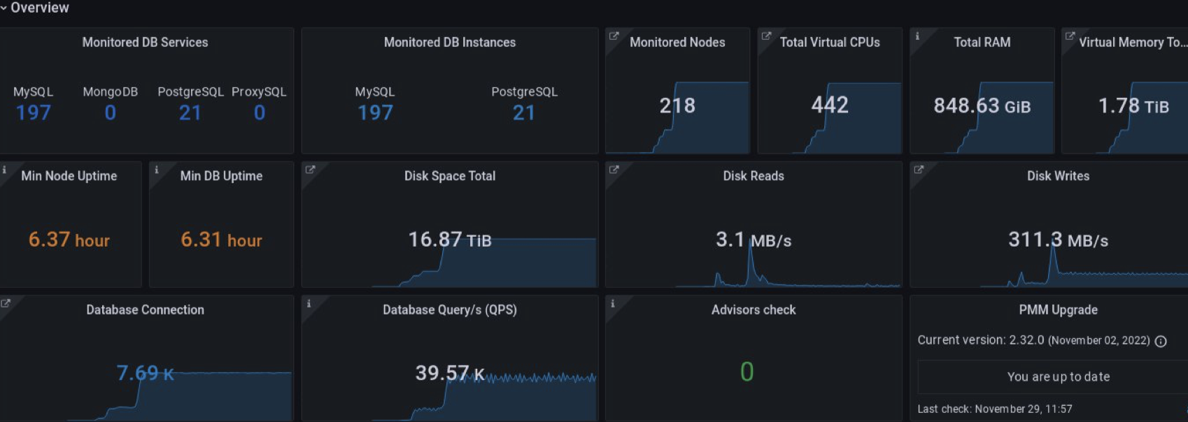
The first version of Overview was changed too. We added more details about different databases. Some panels were removed after feedback. And the main feature is filtering.

Here we tried to create a view where a user can choose the environment and see only its nodes.
That’s how we achieved our final goal - you can open the dashboard, check it, and then drink your morning cup of coffee with a calm mind!
Try this out if you’re already using Percona PMM. If you’re not? You can set up and try out PMM in just a few minutes, start with the Quickstart." ∎


Discussion
We invite you to our forum for discussion. You are welcome to use the widget below.